To the Examiner,
I hope that you have enjoyed looking through all of my posts. I have clearly labelled them to the areas of the magazine that they correspond with, you will find the labels on the right hand side of my blog. I have thoroughly enjoyed producing my magazine as part of my AS level, and I have put a lot of work into it.
Thankyou!
Wednesday 1 May 2013
Tuesday 23 April 2013


Monday 22 April 2013


Thursday 18 April 2013

Question Five, Final!
How did you attract/address your audience?
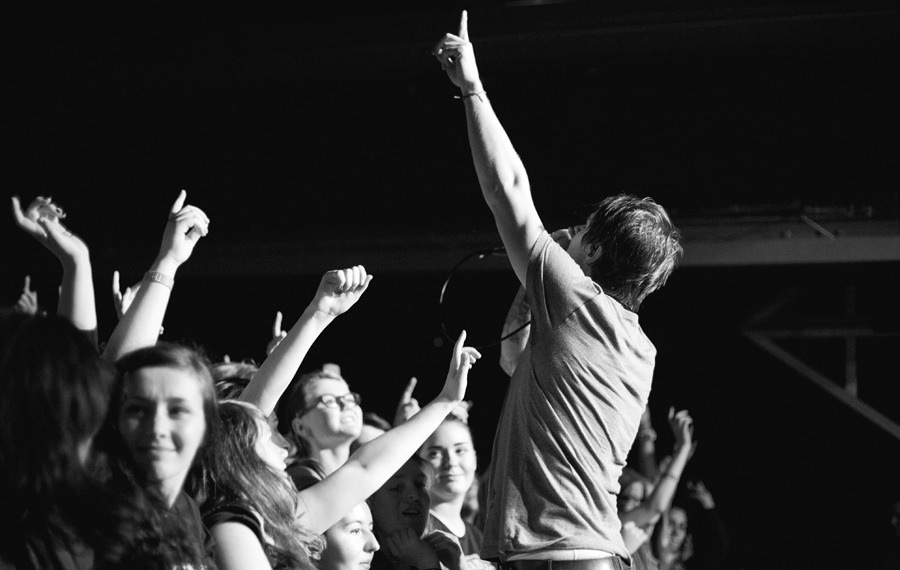
In the contents I used a friendly register where it would appeal to a potential reader having a quick glance through the magazine. I used a tone where it would replicate a friend telling someone about what they had heard or seen. It was supposed to be like the ‘latest gossip’ within the Metal or Rock genre. ‘Until three quarters through breaking point where a five man pit started’ is an example where I wanted it to be something where it would be the next best thing if you weren’t able to be there.
I also used taboo language to enforce the genre of music which I was representing in the magazine (‘Call a fucking ambulance’). This would have attracted my audience as it would have been edgy and therefore connoting the title of the magazine being ‘Explicit’. Explicit is seen as something that would attract a younger audience as an older potential reader would question the name ‘explicit’ because of the negative connotations. However, the younger potential readers would think of the positive connotations as they would think that it would reveal all about everything to do with the music genre. This would also make them feel more comfortable with the articles as the register would have been lowered due to the taboo language.
I also attracted my audience through the clothes that my artists were wearing. This is linked to them wearing their own clothes which would feature within the genre that I am doing. People outside the genre would probably not like the clothes that they were wearing, therefore attracting the audience to feel like they have a connection with the artists featured within the magazine as they would have a similar style. The ‘normal’ clothing that they are wearing also would attract the audience as it would make them think that the artists are more down to earth and are not too bothered about what they are wearing, or what they look like, they just want to focus on their music. This would influence the reader to read the magazine as they know that the artists featured would be genuine.
The colours that I used would normally feature in a music magazine within my genre. This would therefore attract my audience as it is what they would be used too. Also, the fact that the target audience is both male and female would make the colour scheme more influential on whether or not someone would buy the magazine. This is due to the unisex colours of red and blue used throughout. Also, due to the colours being bright, this would also attract the audience as they would look for bright colours. However, this is contrasted through the dark image being used. The dark image would attract the audience as it would add to the effect of the Rock/Metal genre featured within the magazine. This is due to the stereotype of the magazine to be ‘dark, dull and depressing’.
The price of the magazine would also attract the audience as it would be relatively cheap compared to some monthly magazines. Also, due to the amount of pages within (approximately 150 pages) it would be very good value for money. The page number would also attract the audience as a magazine such as Kerrang! only has approximately 70 pages within the magazine making it more suitable for more reviews and information within the magazine, my audience would really like this. Therefore it would attract them to buy the magazine.
Tuesday 9 April 2013
Question One and Five
As I have explained, I need help to separate these as I did it accidentally and it was taking too long to complete the whole power point.
Friday 5 April 2013
Question Four
Who would be the audience for your media product?
My audience would like most sub-genres within the rock and metal genre. They go to a lot of concerts, regularly buy music magazines and follow their favourite artists on twitter or Facebook.
 My audience would mostly shop at stores which have been made by their favourite artists (e.g. Drop Dead) or the merchandise of their favourite bands. They would also stereotypically wear skinny jeans and have piercings and tattoos, and a large amount would stretch their ears (stereotypically).
The audience that I am hoping for would listen to most bands within the genre and have pretty much the same music taste as everyone else, besides a few exceptions.
The TV programmes would alter within the people within the genre as everyone is different, but many people like Big Band Theory, Friends, and Family Guy etc. Also a film which a lot of people like within the genre is Lord of the Rings / The Hobbit.
I think that people who I am hoping to be my audience would want to buy my product because of the fresh new talent that I am hoping to feature within. Also I am hoping to make a magazine which includes the audience as much as possible, allowing them to do reviews and voice their opinions as well as choosing who can be in the magazine.
Saturday 30 March 2013
Tuesday 26 March 2013
Wednesday 13 March 2013


Even more Modifications!


FEEDBACK
DPS
Odessa in red on dps
Smash should be SMASH in explicit font
Call an ambulance in a coloured circle
More Modifications!


FEEDBACK
COVER
Move down the text on the right in line with plus
Name people from the posters
CONTENTS
Do numbers on contents in same font as EXPLICITChange the image above the Editors letter for DPS
DPS
Change call an ambulance to red
Centre align Odessa smash..
Lower S for Smash
Align all columns together
Odessa moved slightly to the left
Centralise call an ambulance, looks wonky
AFTER ALTERATIONS FROM FEEDBACK


COVER
No one wants posters of drumers. No one. Pick front men.
ODESSA still too high up, it needs to be where Asking Alexandra is, the bands on the right MUST be the same size as those on the left.
WHAT IS THE DATE KELLY THERE IS NO DATE!!!!
maybe EXPLICIT IN RED
CONTENTS
Can't read the text in blue. Avoid bold. Makes it seem too busy.
Maybe go three columns rather than 4?
DPS
Text beneath Odessa is too wide. Should be no wider than the title Odessa not the three columns
Still dont like the PULL QUOTE font. Try the ODessa one.
Lower case S for songs
Make the drop letter T the EXPLICIT T
Potentially Finished items


FEEDBACK.....
High level 2 low 3 currently.
Masthead font colour makes it tricky to read. Change colour to Red or white.
Remember thirds. Break you page into thirds (horizontally). Odessa MUST be on intersect of the lower third (i.e. 2/3 DOWN the page or directly opposite the lad with the drum sticks). Currently it is way too high
The other text on the cover is MUCH TO BIG. Ideally that should fit beneath ODESSA in the lower third. Avoid page no's on the cover
Add a strap/banner at the bottom of the page about posters which you can find inside.
Contents High level 2 low 3 currently.
Who are Ellie and that Lad?????? put a page no and Band name next to them
Make contents (top right) smaller. Font size 14 will do.
Right align the text in the letter from the editor.
Description of what is in each section MUST BE NO BIGGER FONT THAN 11!!!!!
The contents should be pg 3 or 5. ALWAYS ODD NUMBER
Bottom right explicit and page no FONT SIZE 8-10 NO BIGGER
More NEWS needed
More live reviews needed.
Put exclamation mark after broken guitars
& NOT AND for Rise Alive and Your Poison
Add more hyperbole for New albums and list at least FIVE new albums you'll be reviewing
For opinionated TELL ME SOME SHOCKING THINGS THEY SAY
GIG GUIDE list loads of bands who you are reviewing
DPS High level 2 low 3 currently.
I REALLY REALLY LIKE THE RIGHT HAND SIDE WHY NOT USE THAT FONT FOR ODESSA?!?!?!
You need a comma after Rugby
Make page no's smaller again (see advice on contents)
Who wrote the article. Add the name of author at the bottom not in the top right
Try page no in RED
Put CALL A F'in AMBULANCE in caps and a different font to make it really pop off the page
Not so keen on the font in the article.
Sunday 10 March 2013
Front Cover


I am unsure about the image on the left hand side of the page. I might be changing that feature, however I am unsure.
Thursday 7 March 2013
Double Page Spread.. Half Complete.
 5th of March 2013 update. Half completed.
 7th March update. Article is half done, mast head and description done.
Sunday 3 March 2013


Friday 1 March 2013
Odessa


I am going to be taking their pictures before their concert at the vault in rugby. The band have agreed for me to use them in my magazine, and to also take images of them during their set. However, I have been doing some research and some contacts in the music magazine business have told me that the best time to take images during a set is during the first 3 or 4 songs. I shall also be taking images of the support bands during their sets, however i am unsure of who they are.
Thursday 21 February 2013
Feedback and what I plan to change...
Mr Fords Feedback
- The COVER with no black splodges
- The mast head is too small
- No colour scheme
- Resize the image, Cover
- Move all of the text down the page, Cover
- Big gaps between 'While She Sleeps', Cover
- Boring 'Interview Inside', Cover
- Not sure if black boxes work well
- 'Your Poison' introduction too wordy, Cover
- Font doesn't work, Contents
- Duplicate page numbers, Contents
- Layout doesn't gel, Contents
- Image needs work, should be clearer, less shadowy, Contents
- Too much space at the bottom of the article, DPS
- 3 columns on each page, or 2 with more text, DPS
- Need images, DPS
- Different sized font on each side, DPS
Low Level 3
Mrs Abrahamsons Feedback
- Excellent level of care and detail in research and planning
- Lots of detail and ideas in magazine, article is convincing
- Model looks good
- No black splodges, Cover
- Avoid 'Find out who' Make it snappier, Cover
- Consider changing the text boxes, Cover + Contents
- Consider the text change for the white text, doesn't look edgy enough, Contents + Cover
- Has a radically different feel to it; not as edgy, Contents
- The blank wall is used as background for both photos, needs changing, Contents + Cover
- Kats facial expression is aggressive, but pose is not, possibly try posing in a different way, Cover + Contents
- Could Zach have drumsticks, Contents + Cover
- Need to make the articles fit the cover lines and main artists featured, DPS
Level 2/3 Border
My Plans for change
- Change the masthead font, Cover
- Change the image, Cover
- Change the text content, Cover
- Change the font, Cover
- Change the layout of text, Cover
- Change the colour of the text on the front, Cover
- Change the brightness/contrast on the Cover
- Take away the black boxes and put a 2cm strip at bottom with competition advertisement, Cover
- More text on Cover
- Change the models outfit and appearance, maybe try with no lipstick, or a different colour. Also alter hair so it is larger.
- Change Zach's outfit, a band top.
- Put both 'Kat' and 'Zach' on the Cover together having a laugh, with DRUMSTICKS as a prop
- Include a COLOUR SCHEME throughout, blue, white and black
- Completely change layout of Contents, have a box with a live image maybe of Kat or Zach, with three columns with text for the page references. Include more artists and page references.
- Change font on Contents
- Make sure that brightness is up for any images used Throughout
- Check spelling and grammar!!!!!!!!
- Check page numbers, Contents
- Change font at top, Contents
- Put more images on possibly, Contents
Wednesday 20 February 2013

Monday 11 February 2013
Kerrang Magazine Analysis..
.jpeg)
I chose Kerrang! due to the main artists that they publish in their magazines being similar to some of the artists that I want my magazine to focus on. Also because many people have a strong opinion of who they feature in their magazine therefore making it easier for me to see which artists would be appreciated within a magazine due to the reception of them in Kerrang!
Layout
I do not like the layout of this particular cover as I think that the large writing takes over the cover too much and does not let the reader focus on the artists within the magazine. Although this is so that people notice the magazine, I think that it could have been done differently with a smaller font! However, I do like that what would normally be down the left rule of third is at the bottom as it doesn't leave much space which is an aspect of a cover that I really like. Also, I like that you cannot see the mast head fully, yet you still understand what magazine it is, I think that this is a feature that only well known magazines can pull off, therefore meaning that I won't be doing so. I shall take what they have done with the 'plus' articles at the bottom of the page into consideration for something to do on my magazine as well as advertising the posters and main article within the magazine.
Images
Although you cannot see the images fully, I do like the poses that they are pulling as they have domineering facial expressions, yet they are proud expressions of them making it into the 250 greatest rock songs. I shall not be doing anything like that for my magazine as it is only a first issue. Also I like the smaller images at the bottom advertising the posters within the magazine. As well as the advertising of the posters, I also really like the images advertising the festivals that the magazine will be covering. I shall be doing this with my magazine due to recent festival announcements.
Font
I do not like the font of the advertisement for 'the 250 greatest rock songs of 2012' as I think that it is too large, even though it is an advertisement, I still don't like it as it takes up too much space. However, I do like the font used as it is clear and I may use a font similar to this for my magazine as it is effective and bold. Also, I like the way that all of the text are in capitals, it extends the connotations of a rougher genre of music as if someone were shouting, or screaming in some cases within this genre.
Colour Palette
The colour palette of the magazine is predominately yellow, red, white and black. I like this palette as it is individual to Kerrang! therefore the audience will recognise the colours if they were to purchase the magazine regularly. I also like the colour palette as it will appeal to everyone, and even though the colours are fairly bright, they do not take away from the rest of the page (such as images).
.jpeg)
I do not like the layout of the contents as the columns are not big enough and the image takes up too much space than what is needed. I do not think that the layout helps the advertisement of what is inside of the magazine. However, if the image were a background and the columns over the image without the block white background then I think that it would look much better. Also, I do not like that the letter from the editor takes up so much space at the bottom and it could have been smaller and placed more to the right, and switched with the image at the bottom. I do like the banner at the top of the page stating that it is the contents page. However, I do think that the banner is too large and could have been shortened and the edge not as neat as it is, such as it could have been similar to the Metal Hammer contents title.
Images on the Contents
I do not like that there are not any images of what will be inside, and that there are only images of what competitions are within the magazine. I would prefer it if there were images advertising what artists were in the magazine. However, the image of Papa Roach would have been good for a double page spread as the male gaze from the band is good and effective as they have a stern expression on their face, but they still don't look too intimidating, which is good considering that they are advertising for a meet and greet. I think that the image of the editor was unnecessary and it could have been equally as important without the image, however I think that the contents needed the image or else it would have looked too boring.
Fonts on the Contents
The font on the contents are similar to what is on the cover as they are bold. However, instead of all the text being in capitals, only the important bits are in capitals, such as the artists names, and the rest in a normal font. I like the use of a plain, yet bold font as it is easy to read and with this genre of music it fits in well as the reader wouldn't want a fancy font or something to be in italics. I also like the different sizing of the fonts with highlighting the band and the competition with a larger font as it draws the eye of the reader to the competition which is something that I may use within my magazine.
Colour Palette on the Contents
The colour palette on the contents is the same as on the cover as it follows the basic guidelines that Kerrang! have with their basic structures which are included in every issue. I do not like that the image is really dark so that it contrasts with the background as the text as I think that it could have been done better as it makes the page look too plain. I shall not be doing this in my magazine.
.jpeg)
Layout of the Double Page Spread
I really like the layout of this as it is busy, but doesn't look messy. I think that the columns are effective as they are neat but because they are slightly off centre it works really well with the magazine. Also, I really like the layering of the images and text on the left page. I also really like the image as the background, with text over it. I think that I might use this technique within my magazine as it looks good and effective! Also, I like the positioning of the header of the DPS as it takes up space but catches the readers eye!
Images on the Double Page Spread
I like the large image on the background of the left page as it helps to tie the article together. Also I like that it is accompanied by other live images as it helps the reader to understand the article more. Also it is very effective as it is a remembering piece about Nirvana meaning that the live images will always be recognised and appreciated even more than normal live images. I also like the sizes of the images as they do not take up too much space, but you can still see the facial expressions. Also I like the decisions of photographs with the lighting within them, as you can get the atmosphere of the concert better. I really want to use some live images for my magazine, however, I don't have many images that I can use as they are mostly not acceptable for magazine purposes.
Font on the Double Page Spread
I really like the large font on the left page, I think that it really helps the article to be 'revolutionary'. I like that the word 'revolution' is in a different font to the other bold, yet recognisable font, as it expands on the revolutionary idea of the article. Also, I like the size of the sub-heading as it is not too large, but also contributes well to the article. The main font of the article itself is bold and plain, therefore I like it a lot as it would be easy to read. I may take all of this into consideration whilst making my magazine.
Colour Palette on Double Page Spread
The colour palette of the double page spread is blue white and black, I don't really like this colour scheme as it is too boring and pale. However, I like the use of three colours and the colour scheme does go well together, but the colours are too plain to use for my magazine as I do not think that my magazine would benefit well from these colours.
Friday 8 February 2013


Thursday 7 February 2013
Draft Photo Shoot 1
These are images from my draft photo shoot with my artist 'Kat Merry'. When requesting for her to feature in my magazine I asked her to pick clothes which would fit in with the styles of Hayley Williams, Taylor Momsen, P!nk and Avril Lavigne (all well known females in the rock genre). I also asked for the t-shirt not to be light due to her pale complexion and her fairly light hair. I also asked for her not to wear an overly dark t-shirt either, i.e. black. This was due to her being pale and fair haired, meaning that she would have looked completely washed out if she wore something of that sort. Also, I asked for 
 her to not wear a dress or skirt as it would not fit in with the conventions of a female within the rock genre. However, I also asked for her to not wear jeans unless they were ripped as they would not fit in with what I wanted to do with her within the images. Therefore she wore shorts with grey tights. I am very pleased with the clothes that she decided to wear as they worked well by contrasting against the light back drops making her stand out even more. I also asked if she could have her hair natural (As I previously knew that her hair was wavy) and back combed as she has relatively thin hair. After a while though, her hair flattened, however this turned out to work with my images as it looked good and she didn't look as intimidating as before. I also asked for her to have relatively dark eyes as I wanted them to stand out, and also to put red lip stick on as it would make her expressions with her mouth clearer as I had planned for her to be smiling or doing expressions with her mouth open prior to asking her. I also asked for her to wear her plugs (ear stretchers) so that she would again fit in with the conventions of the music genre. I also asked her to paint her nails black as it would again fit in with the conventions of the music genre. I also asked her to wear minimalist jewellery as it would not have looked right if she were to wear lots of jewellery. Also, she wore her 'Reading Festival' wristband
 which looked good on my images as that is the kind of festival that her music would be featured at. I also asked my artist to wear shoes which would contrast against the rest of her outfit in case I were to take any long shot images, which I did end up doing. I also asked for her to wear vans in particular as artists such as her have appeared at 'Vans Warped Tour'. I also told her to pull faces which could have an intimidating look towards her, but also images which could make her look like she is friendly as she is having a laugh, such as the image above. However, I need to take more images to get the right facial expression. I chose the locations of my images mianly because of the run down landscape within my college. However, I want to take more images with different backgrounds as I
think that for the DPS that would be good and effective. However, I also think that a darkened background image would be good for the cover, although it may not conform to the norm of a rock/metal genre music magazine. For all of the images I asked my artist to pull faces which

would make her look kind, but also someone who is new but belongs in the music genre and in this magazine. I also asked her to have a laugh and mess around, but that did not happen according to plan, so hopefully when she gets put with my other artist in the
next photo shoot, she shall be more comfortable with him and they shall be able to mess around together. The inspiration for that has come from an issue of Kerrang! where they had Josh Franceschi (of YOU ME AT SIX) and Oli Sykes (of BRING ME THE HORIZON) where they ended up giving eachother piggy backs and having a laugh, and then their relationship and the banter was also shown through the article aswell.


Subscribe to:
Posts (Atom)